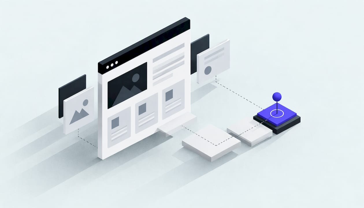
Conversion-focused web design means building a website around the one action you want a visitor to take, whether that is a call, a quote request, a booking or a purchase, and removing anything that gets in the way. For a UAE small business, it is the difference between a site people admire and a site that fills your inbox and WhatsApp with real enquiries. This guide explains the principles, shows how to apply them to lead generation, and sets out what to measure once the site is live.
TL;DR
- A conversion-focused site is designed around a business goal first and aesthetics second: every element either helps a visitor act or is removed.
- Seven principles cover most of the work: focus, structure, consistency, benefits, attention, trust and low friction.
- For lead generation, one clear call to action per page and short, honest forms matter more than extra features.
- Speed, mobile usability and visible trust signals decide whether a visitor stays long enough to act.
- Measure before you redesign: set up tracking, watch real behaviour, then change one thing at a time.
Table of Contents
- What conversion-focused web design actually means
- Seven principles that make a site convert
- Designing for lead generation: calls to action and forms
- Mobile, speed, navigation and trust
- A practical order of work for a small business
- Measuring conversions and improving them
- Applying this to a UAE small business
- Our perspective
- Websites built to convert, at fixed prices
- FAQ
- Sources
What conversion-focused web design actually means
A conversion is any action that moves a visitor towards becoming a customer. Baymard, a research institute focused on usability, describes conversion design as putting conversion ahead of aesthetics: structuring each element around the site's strategic goal, typically selling more or getting sign-ups, and removing elements that do not improve usability.
Shopify frames the same idea as conversion-centered design: arranging a site to guide visitors towards a specific desired action, by simplifying conversion flows, clarifying calls to action and rearranging design elements. The point is that conversion is not a trick added at the end. It is the brief the whole page is built from.
This changes the questions you ask at the start of a project. Instead of "what style do we like?", you ask:
- Who is the visitor, and what are they trying to solve?
- What single action do we want from them on this page?
- What would stop them taking it?
A website for a Dubai dental clinic, a Sharjah logistics firm and an Abu Dhabi consultancy will answer those questions differently. The clinic wants appointment bookings, the logistics firm wants quote requests, the consultancy wants discovery calls. A site that tries to do all three equally usually does none of them well.
Seven principles that make a site convert
Shopify's guide lists seven principles: create focus, build structure, stay consistent, show benefits, draw attention, design for trust and reduce friction. HubSpot's write-up of the same framework adds that a conversion-centered landing page is aligned to a single business goal, with clarity, relevance and urgency as core components. Here is how each principle looks on a real small business site.
Focus: one page, one job
Each page should have one primary action. A service page's job is to get an enquiry, not to send visitors to your blog, your careers page and your social profiles. Keep the navigation lean on pages built to convert, and make the main button the most visible thing on the screen.
Structure: lead the eye in order
Visitors scan before they read. A reliable order is: a headline that states what you do and for whom, a short supporting line, the main call to action, proof, then detail. Put the answer to "am I in the right place?" in the first screen, without scrolling.
Consistency: the same promise everywhere
If your advert says "free quote in 24 hours", the landing page should say the same, in the same words, with the same button label. Mismatches between the ad, the page and the form make people hesitate. The same goes for visual style: buttons that look like buttons everywhere, one accent colour reserved for the main action.
Benefits: say what changes for the customer
Features describe you. Benefits describe the visitor's outcome. "Custom-built, no templates" is a feature; "a site shaped around how your customers actually buy" is the benefit. Lead with the second and support it with the first.
Attention: make the action obvious
Contrast, white space and size direct attention. If everything is bold, nothing is. Reserve your strongest visual weight for the headline and the call to action, and let the rest recede.
Trust: remove the doubt
Real client names, real project examples, clear pricing, a visible phone number and a named person all reduce perceived risk. Trust also comes from basics: a secure connection, a readable privacy notice, and no broken pages. For payments, Daleen Spence of Incubeta, speaking in a Google Business article, advises showing recognisable payment icons rather than hiding them behind extra clicks, and defaulting to the payment methods people in their region use.
Friction: take away every unnecessary step
Every extra field, pop-up, forced registration or unclear label is a place to lose someone. Reducing friction is usually the cheapest improvement available, because it works on traffic you already have.
Designing for lead generation: calls to action and forms
If your site sells services rather than products, your conversion is an enquiry. That puts the call to action and the form at the centre of the design.
Write calls to action that say what happens next
"Submit" tells the visitor nothing. "Get my free quote", "Book a 15-minute call" or "See a demo of my site" says what they receive. Repeat the same action at natural decision points down the page rather than inventing five different ones. Visitors who are ready should never have to scroll back up to find the button.
Keep forms short and honest
CXL's best practices collection recommends several habits that apply well to small business forms:
- Tell people what to expect after they submit.
- Ask only for information you genuinely need, and mark which fields are required and which are optional.
- Start with the easiest fields first.
- Use inline validation so mistakes are flagged as people type, not after they press send.
- For long forms, split them into steps with a progress indicator.
- Where you collect sensitive information, show trust cues beside the form.
For most UAE service businesses, the first enquiry needs only a name, a phone number or email, and one line about what they want. You can gather the rest on the call.
Offer more than one way to get in touch
Not every visitor wants a form. A visible phone number, a click-to-chat button and an email address let people choose. Many businesses in the UAE are contacted by messaging as readily as by form, so make that route as clear as the form. If you want to answer these messages instantly and around the clock, our WhatsApp agent for customer engagement is built for exactly that handoff between website visit and conversation.
Build pages for a specific audience
Anna Potanina, founder of CTAD, advises in the same Google Business piece that landing pages should be designed around a narrow, well-defined group of people, with relatable, goal-based visuals and a three-second loading speed, and that a dedicated page for each campaign audience can pay off in engagement and conversion. In practice: one page for "restaurant owners in Dubai" and another for "clinics in Abu Dhabi" will usually convert better than a single page for "businesses".
Mobile, speed, navigation and trust
These four decide whether a visitor stays long enough for your design to matter.
Mobile. Open your own site on a phone, on mobile data, and try to complete the main action with one thumb. Buttons should be easy to tap, text readable without zooming, and the phone number tappable. If the form is painful on a phone, fix that before anything else.
Speed. A slow page loses people before they see your headline. Heavy images, unoptimised scripts and bloated plugins are the usual causes. Our site performance and technical fixes service, from $400, is aimed at precisely this: finding what slows the page and fixing it.
Navigation. Keep the menu to the handful of pages a buyer needs: services, pricing or process, work, about, contact. Use plain labels. "Solutions" means little; "Web design" means something.
Trust signals. Place proof near the action: a short client result beside the form, named projects, your address and licence details where relevant. Accessibility also builds confidence and widens your audience, and a WCAG 2.2 AA accessibility audit, from $300, shows where a site stops some visitors from completing the action at all.
For online shops, the final step deserves particular attention. Google's article reports that in the Middle East and North Africa 60% of shoppers abandon purchases because of payment issues. Clear payment options, a short checkout and no surprise charges are worth more than any homepage redesign.

A practical order of work for a small business
You do not need to rebuild everything. A sensible sequence:
| Step | What you do | What it fixes |
|---|---|---|
| 1. Define the goal | Pick one primary action per key page | Unfocused pages |
| 2. Set up tracking | Record form sends, calls, chat clicks | Guessing instead of knowing |
| 3. Fix the basics | Speed, mobile layout, broken links | Visitors leaving early |
| 4. Rewrite the first screen | Headline, support line, one clear button | Unclear value |
| 5. Shorten the form | Ask only what you need | Abandoned enquiries |
| 6. Add proof | Clients, projects, named contact | Doubt at the moment of decision |
| 7. Improve and repeat | Change one thing, measure, keep or revert | Opinion-led redesigns |
If your site is old enough that these fixes would be bigger than a rebuild, a new custom build can be the cleaner route. Our guide to custom website development in the UAE covers scope, process and cost.
Measuring conversions and improving them
A conversion rate is simply the number of people who completed the action divided by the number of visitors, per page or per traffic source. Without reliable tracking, that number is fiction, so start there.
What to track
- Form submissions and the page each came from.
- Calls and chat clicks from mobile visitors.
- Conversion rate by source: search, ads, social and direct behave very differently.
- Drop-off points: where in a form or checkout people leave.
- Page speed on mobile, since slow pages depress every other number.
A broken tag can quietly mislead you for months. Our GA4 and tracking health check, from $250, checks that your conversions are being recorded correctly before you make decisions on them.
How to find what to change
Shopify's guide recommends gathering insight from heat maps, session recordings, A/B tests, surveys and user interviews, then iterating the design to reduce friction. For a small business with modest traffic, start with the simplest tools: watch a few session recordings of people who left your form, ask recent customers why they chose you, and compare the pages that convert with those that do not.
A/B testing needs enough visitors to give a meaningful result. If your page receives a few hundred visits a month, make one deliberate change at a time and compare month on month rather than running split tests.

Applying this to a UAE small business
A few local considerations shape the design choices:
- Language. If your customers read both Arabic and English, give each language a properly designed page rather than a translated afterthought. Layout, spacing and form behaviour all need checking in both directions of reading.
- Contact habits. Make calling and messaging as prominent as the form, so a visitor can reach you the way they prefer.
- Local proof. Name the areas you serve, show projects for companies recognisable in the Emirates, and give a clear business address or service area.
- Pricing clarity. Where you can publish prices or starting points, do it. Visitors who see a range arrive better qualified and ask fewer questions about cost.
- Visibility. A site that converts well still needs visitors. Search optimisation and a well-kept Google Business Profile bring the right people to the page, which is why design and SEO work best planned together.
Our perspective
Most small business websites we are asked to fix were not badly designed. They were designed without a goal. They look fine, they list services, and nobody can tell what the owner wants a visitor to do.
That is why we start with the action, not the look. We build custom sites without templates, so the structure can follow how your customers decide: one clear action per page, short forms, proof close to the button, and pages that load quickly on a phone.
We also think you should not have to take a design on faith. Before any payment, we show you real demo work or a written diagnostic, so you can judge whether we understand your business. The work is done by me directly, with no account manager between you and the person building your site, and our prices are fixed and published with a clear scope.
After launch, you get a plain monthly report on what we did on your site and your Google Business Profile. Conversion work is never finished, and we think the honest way to run it is to show you what changed.
Adel
Websites built to convert, at fixed prices
If you want a site built around enquiries rather than decoration, our web design service for Dubai businesses offers a Starter Website at AED 1,800 one-off and a Business Website at AED 3,500 one-off, both custom and not template-based. A website care plan is available at AED 299 per month. You can see demo work before you pay anything.

If traffic is the bigger problem, our local and growth SEO plans start at AED 1,500 per month. For every service and tier in one place, see the full pricing page.
FAQ
What is the difference between conversion-focused design and normal web design?
Normal web design often starts with look and feel. Conversion-focused design starts with the action you want visitors to take and arranges the page to support it. Baymard describes it as prioritising conversion over aesthetics, while still removing anything that harms usability.
How many fields should a lead form have?
As few as you need to follow up properly. CXL recommends asking only for required information, marking optional fields and putting the easiest fields first. For most service businesses, a name, a contact method and a short message is enough for a first enquiry.
Does page speed really affect conversions?
Yes, because a visitor who leaves before the page loads never sees your offer. Anna Potanina of CTAD advises aiming for a loading time of three seconds for landing pages. Compressing images and removing unused scripts are the usual first fixes.
How do I know if my website is converting?
Set up tracking for form submissions, calls and chat clicks, then compare conversions with visitors for each page and traffic source. If the numbers look odd or empty, check that the tracking itself is working before changing the design.
Should every page have the same call to action?
Not necessarily, but each page should have one primary action, and the label should say what happens next. A service page might push "Get a quote", while a pricing page might push "Book a call". Keep the wording consistent with the ad or link that brought the visitor.
Sources
- Conversion Design: the Real Purpose of Web Design, Baymard
- Conversion-Centered Design Explained and How To Apply It, Shopify
- The 7 Principles of Conversion-Centered Landing Page Design, HubSpot
- Cracking the conversion code: 3 design secrets that make people hit buy, Google Business
- Best Practices, CXL